Redefine Foods Brand Work
A packaging redesign for Redefine Foods — keeping the logo people know and giving everything around it a more modern look, from Oatmeal Protein Pies to the co-branded Skippy flavors.
The brief
Redefine Foods had a logo worth keeping, but its packaging was starting to look dated next to newer snack brands. The goal was a more modern look without losing the recognition the brand had already built.
The new designs had to make the protein pies look like a treat first and a protein snack second, and work across flavors like the Skippy collaboration, single wrappers and retail display boxes.
Our approach
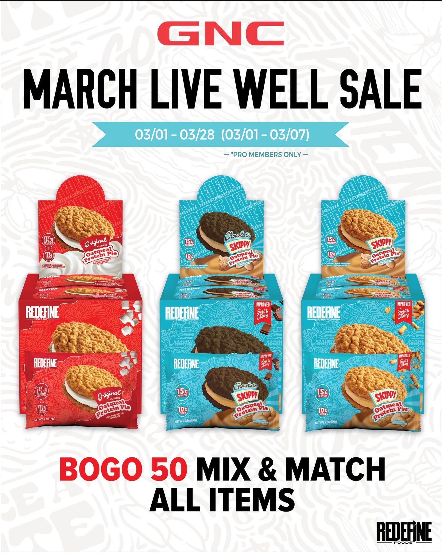
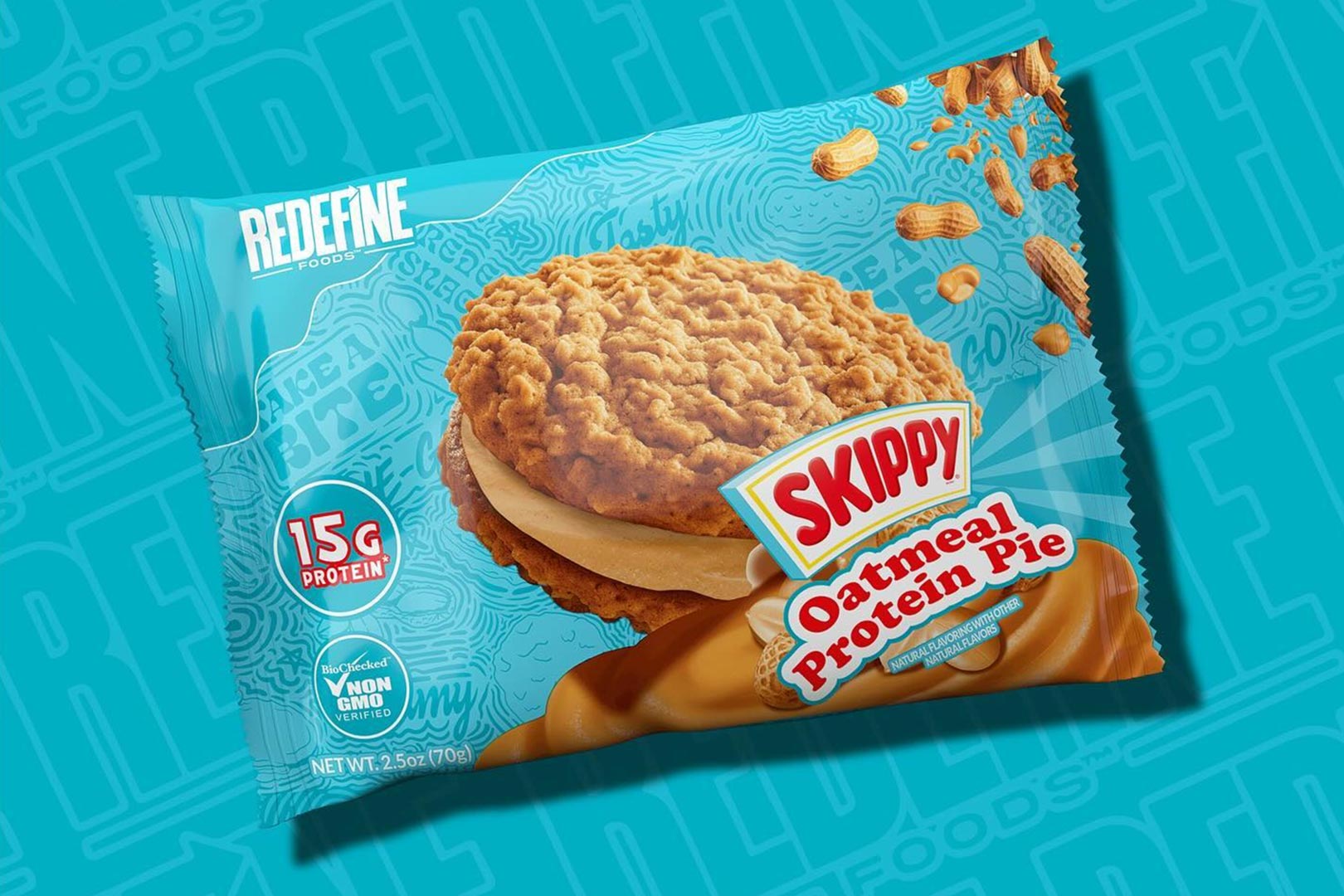
We kept the logo and retooled everything around it. Hero product photography leads, a bold flavor-coded color system — red for Original, blue for the Skippy line — makes each flavor easy to spot, and the 15g protein claim stays front and center.
We designed the wrapper and the display box together, so a single pie and a full box on a counter tell the same story — a system that also stretched into retail promotions like GNC’s.
What we delivered
- Packaging redesign built around the existing logo
- Oatmeal Protein Pie wrappers
- Co-branded Skippy flavor packaging
- Retail display boxes
- Retail promotion assets
Why it works
A redesign doesn’t always mean starting over. Keeping the logo held on to the recognition Redefine had earned, while the modern packaging makes the product look as good as it tastes.