Kreo Brand Work
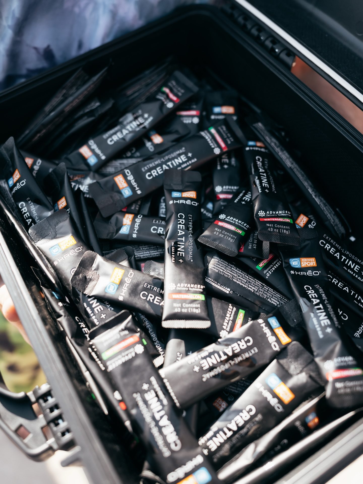
A brand built from zero for KRĒO — liposomal nutrition for athletes — launched with Creatine+ in a black-on-black stick pack.
The brief
KRĒO came to us with an idea and no brand: liposomal nutrition built for athletes. Everything people would see — the logo, the look, the packaging — had to be created from scratch.
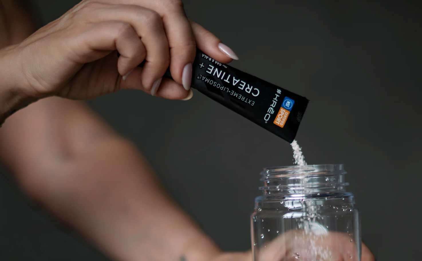
The first product, Creatine+, comes in a single-serve stick pack, so the brand had to work in a slim format where every millimeter counts, while keeping the liposomal story, the flavor and the NSF Certified for Sport mark easy to read.
Our approach
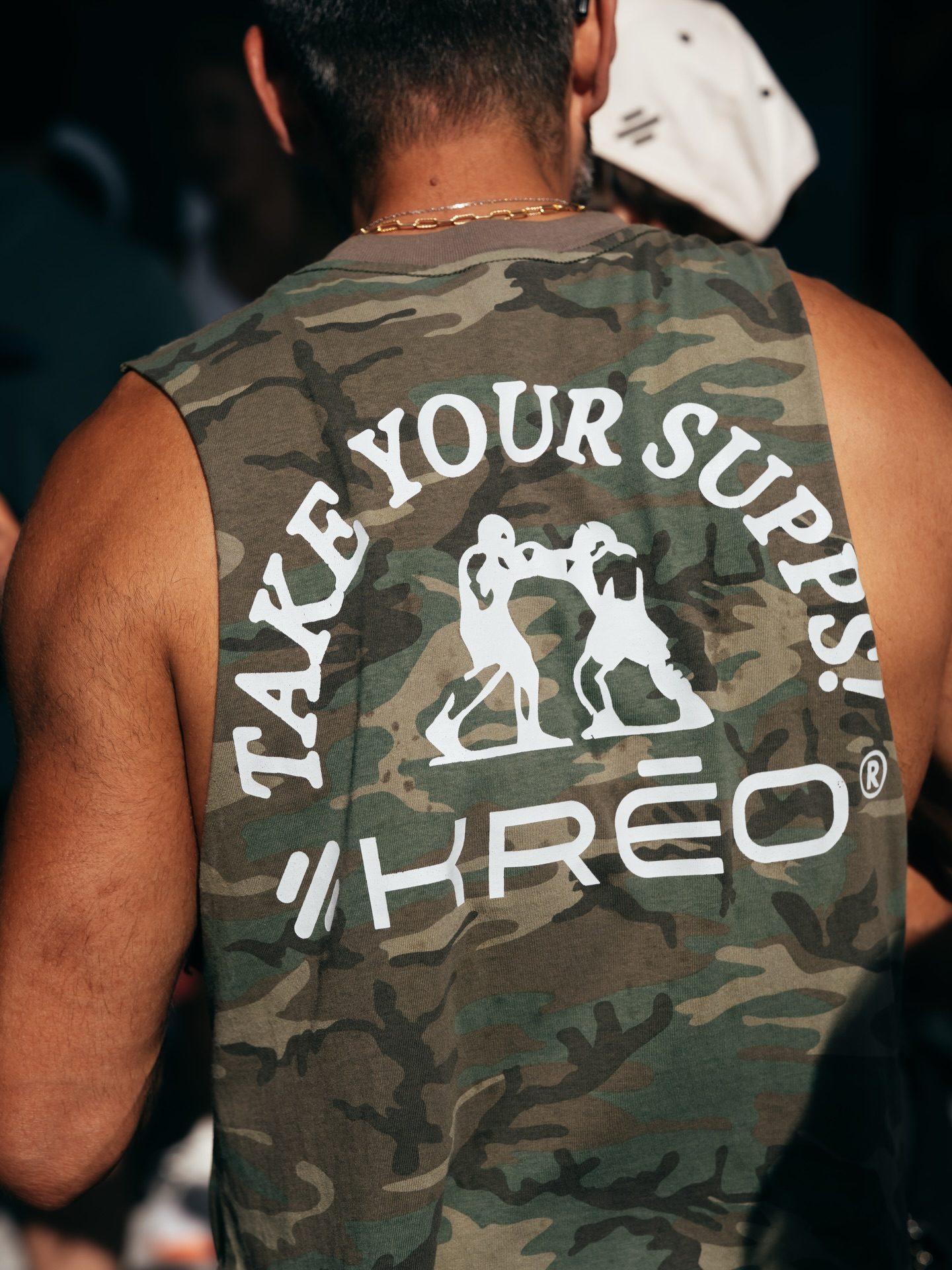
We spent a full year with KRĒO building the brand from the ground up. The direction we landed on is black on black: a dark, premium look that feels closer to performance gear than to the supplement aisle, and stands apart from the bright, loud packaging most of the category relies on.
Inside that palette, the type does the work. The KRĒO wordmark, Creatine+ and the liposomal callout stay crisp and easy to read, flavor gets its own accent, and the NSF Certified for Sport mark sits front and center — the detail serious athletes check first.
What we delivered
- Complete brand identity, built from zero
- KRĒO logo and wordmark
- Black-on-black visual system
- Creatine+ stick pack packaging
- Claims and certification hierarchy
Why it works
Building a brand from scratch means every decision sets the tone for what comes next. A year of work gave KRĒO a look that’s unmistakably its own — dark, focused and made for athletes — and a system ready for every product after Creatine+.