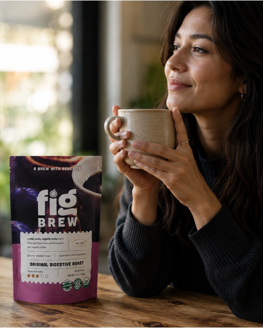
Fig Brew Brand Work
A complete brand redesign and new logo for Fig Brew — an organic, caffeine-free coffee alternative built to take on modern competitors.
The brief
Fig Brew’s old brand looked outdated, and the coffee-alternative category had filled up with modern brands offering their own takes on a coffee replacement. Fig Brew needed to look like it belonged in that new wave — and stand out from it.
The new brand had to win over coffee drinkers, make a fig-based, caffeine-free brew feel warm and familiar, and make “superfood coffee alternative” clear the moment someone sees the pouch.
Our approach
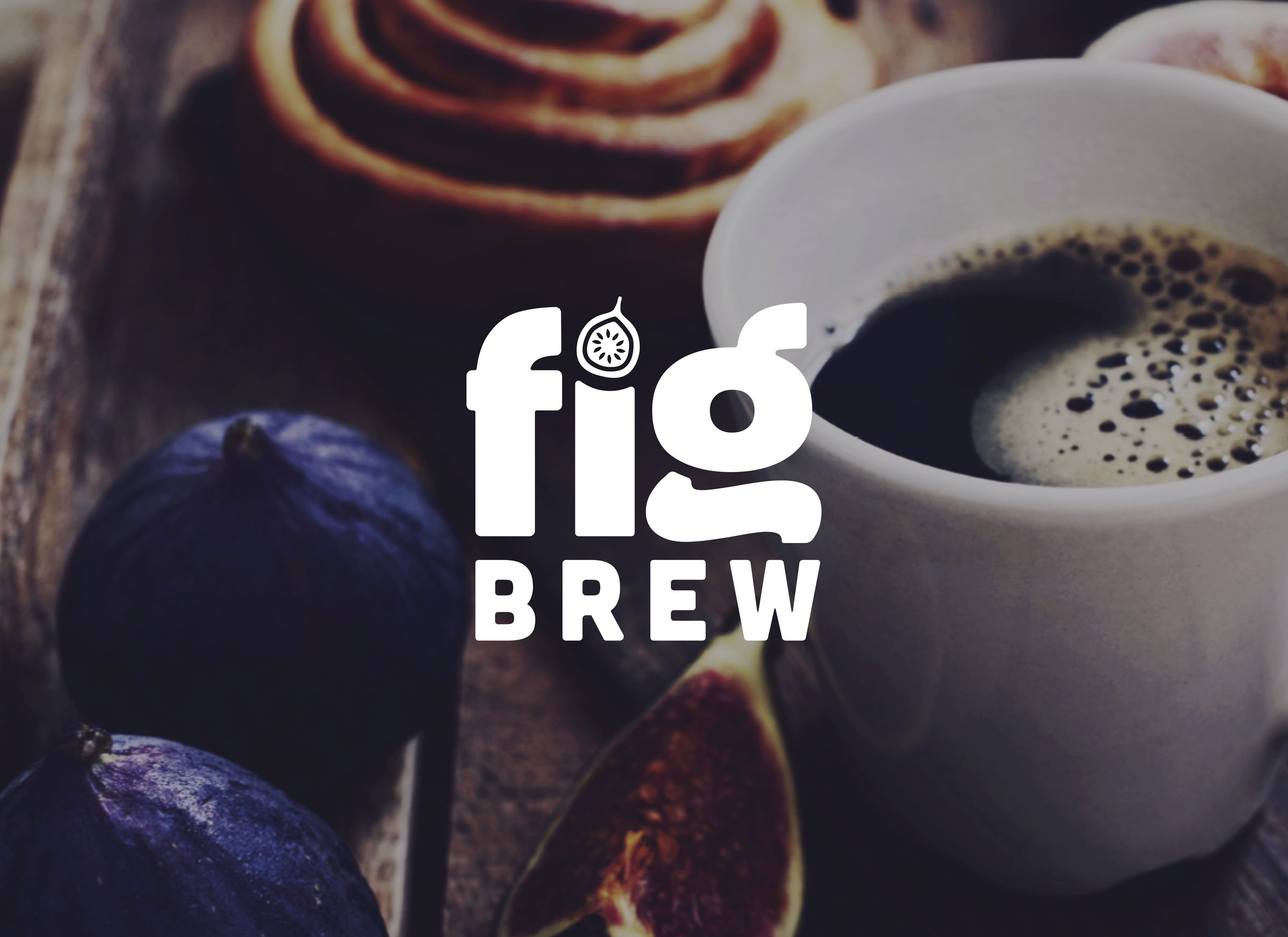
We redesigned the brand from the logo up. A new hand-drawn fig wordmark gives Fig Brew a warm, handmade character, and rich fig-and-coffee imagery makes the product read like coffee before anyone reads a word.
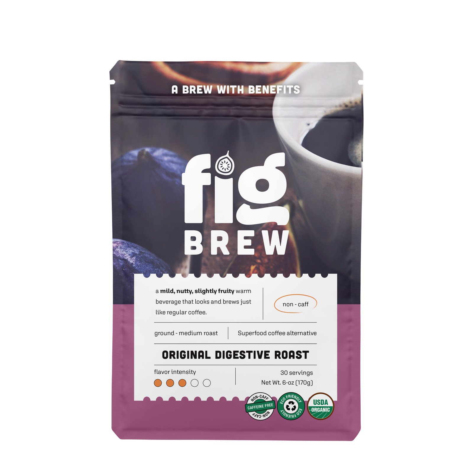
On the pouch, “A brew with benefits” leads, the organic and non-caff marks are easy to spot, and a clean info panel spells out taste, roast, servings and flavor intensity — the details coffee drinkers look for when comparing.
What we delivered
- Complete brand redesign
- New logo and hand-drawn wordmark
- Pouch packaging design
- Product information panel
Why it works
Asking coffee drinkers to switch is a big ask, and they now have plenty of options. A modern brand that looks and talks like their coffee — while making the benefits obvious — gives Fig Brew a real shot against newer competitors.