Jocko Fuel Brand Work
An updated look across Jocko Fuel’s cans, powders, hydration drinks, Jocko Pro series and Warrior Kid line — built from the brand’s own assets.
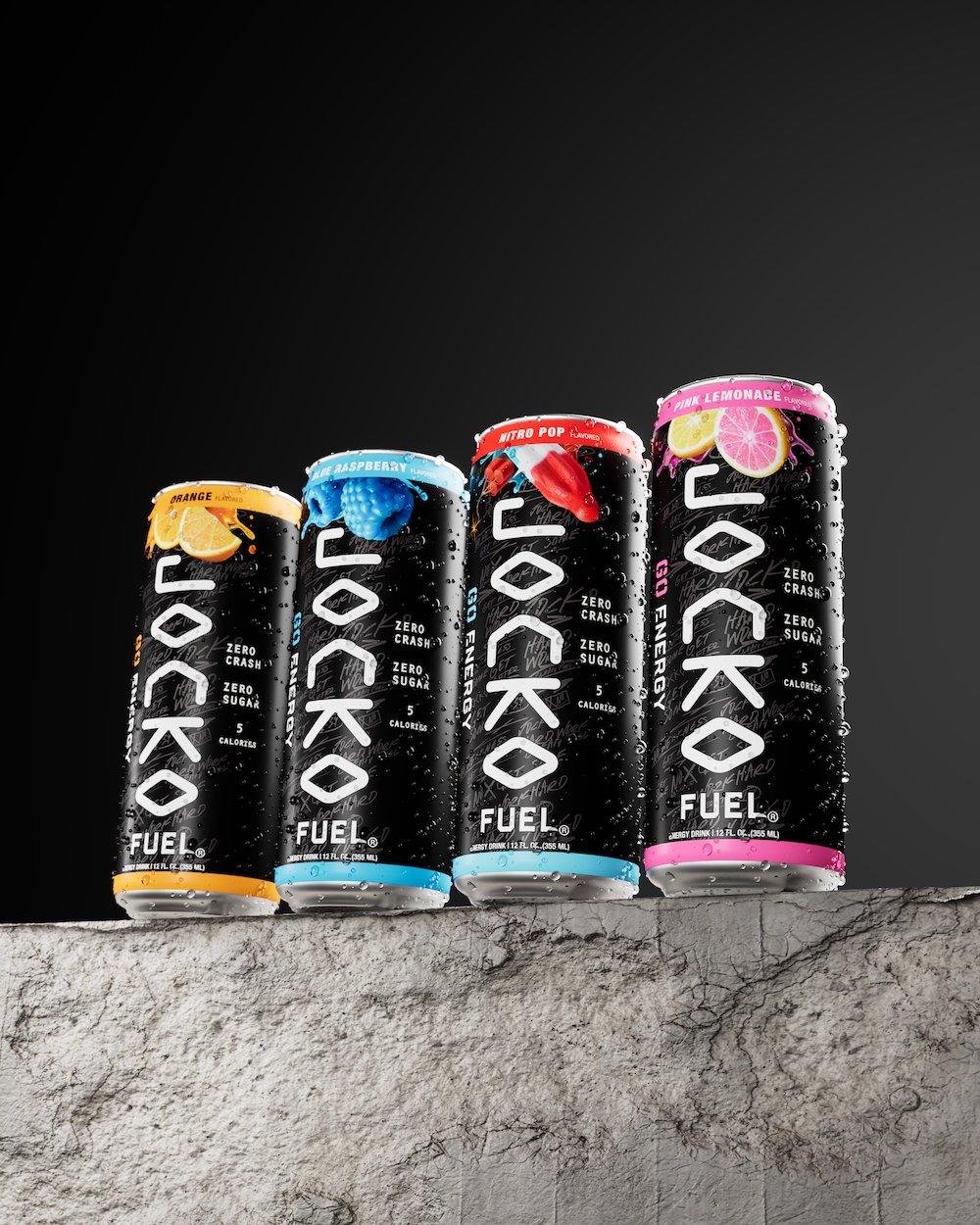
The brief
Jocko Fuel had grown into a wide range: energy drink cans, powders, hydration drinks, the Jocko Pro series and the Warrior Kid line. The brand already had strong assets, but the look needed updating so the whole range felt current and consistent.
The goal wasn’t to start over. It was to keep everything people already recognize as Jocko Fuel and make it work harder across every format.
Our approach
We worked from Jocko Fuel’s existing assets and modernized how they come together. Type, color and layout were tightened into a shared system that carries from a can to a powder to a hydration drink.
Inside that system, each line gets its own clear signal, so energy, hydration, Pro and Warrior Kid are easy to tell apart on shelf while still reading as one brand.
What we delivered
- Energy drink can packaging
- Powder packaging
- Hydration drink packaging
- Jocko Pro series packaging
- Warrior Kid line packaging
- An updated packaging system built from existing brand assets
Why it works
When a brand already has loyal fans, the best update keeps the recognition and sharpens everything else. Building from Jocko Fuel’s own assets kept the brand familiar while giving every line a cleaner, more current look.